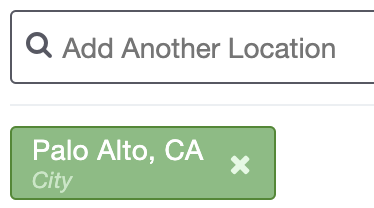
When someone does a search on your website, they will enter a location in the location field of the search bar. Once the location has been selected (either by clicking with the mouse or the enter key) it will lock in the location into the search query and the location will then show up as a 'pill' which displays in green.

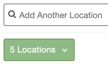
This pill will allow a user to remove the location with the X function if they made a mistake or changed their mind. They can add as many locations as they would like. It will display three locations before consolidating them into one dropdown.
Here is what three locations would look like:

Here is what more than 3 would look like:

Customization Options
Background Color:
The default color for both pills is green, however you can change the background color. Here is an example making the singular location pill blue:
![]()
*To change the singular location pill background color:
.sidx-container .sidx-primary-pill, .sidx-container .sidx-secondary-pill {
background-color: #hexcode !important;
}
*To change the consolidated multiple location dropdown background color:
.sidx-container .sidx-dropdown-pill.sidx-primary {
background-color: #hexcode !important;
}
------------------------------------------------------------------------------------------------
Border:
The button by default has a 1px border. You can make a border look many different ways. At Showcase IDX we like to use '1px solid' to define a border on buttons. 1px sets the thickness of the border and solid defines the style of the border. Here is an example of a 5px solid border to the singular location pill:

*To change the singular location pill border color:
.sidx-container .sidx-primary-pill, .sidx-container .sidx-secondary-pill {
border: 5px solid !important;
}
*To change the consolidated multiple location dropdown border color:
.sidx-container .sidx-dropdown-pill.sidx-primary {
border: 5px solid !important;
}
------------------------------------------------------------------------------------------------
Border-Color:
You can also change the color of the border. Simply add a hexcode prefixed with a hashtag. Here is an example of a black border color to the singular location pill:

*To change the singular location pill border color:
border-color: #555867 !important;
}
*To change the consolidated multiple location dropdown border color:
.sidx-container .sidx-dropdown-pill.sidx-primary {
border-color: #555867 !important;
}
------------------------------------------------------------------------------------------------
Border-Radius:
Changes the squareness of the pill. The higher the number, the more round the pill will be. Default is set to 3px. Here is an example of the border radius set to 20px:

border-radius: 20px !important;
}
*To change the consolidated multiple location dropdown border-radius:
.sidx-container .sidx-dropdown-pill.sidx-primary {
border-radius: 20px !important;
}
Box-Shadow:
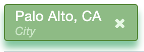
The button by default does not have a shadow around the bottom. If there was a box-shadow, an example would be 0 1px 1px #99a9af. 0 sets the shadow directly under the button, the first 1px sets the size of the shadow, the second 1px sets the fade of the shadow and the hexcode sets the color. Here is an example of the box-shadow set to 0 7px 7px #1acb98:

*To change the singular location pill box-shadow:
box-shadow: 0 7px 7px #1acb98 !important;
}
*To change the consolidated multiple location dropdown box-shadow:
.sidx-container .sidx-dropdown-pill.sidx-primary {
box-shadow: 0 7px 7px #1acb98 !important;
}
------------------------------------------------------------------------------------------------
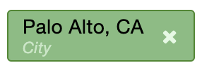
Padding:
![]()
padding: 10px 25px !important;
}
*To change the consolidated multiple location dropdown padding:
.sidx-container .sidx-dropdown-pill.sidx-primary {
padding: 10px 25px !important;
}
Text Color:

color: #hexcode !important;
}
*To change the consolidated multiple location dropdown text color:
}
-------------------------------
Multiple Changes:
*If you were to use all of the above properties to update your button, your code may look like this when placed into your design settings:
padding: 25px 15px !important;
border-radius: 6px !important;
box-shadow: 0 7px 7px #1acb98 !important;
background: #1acb98 !important;
color: #ffffff !important;
border: 1px solid !important;
border-color: #febe0f !important;
}
Place the desired code(s) in the Custom CSS box under Settings > Design. You must clear your caches, then check your web page in an incognito browser to see the change!
Customization Disclaimer: Please note, Showcase may make future updates to the product which may break previously acceptable CSS code, causing that section on your website to look unusual. If you've noticed your site not looking as expected, please return to this article for the updated CSS code. Additionally, as always, if you are inexperienced with CSS we suggest you turn to your developer as they will be the best contact person for CSS related questions and concerns. We are not developers and provide this baseline CSS for agents and developers experienced in coding.